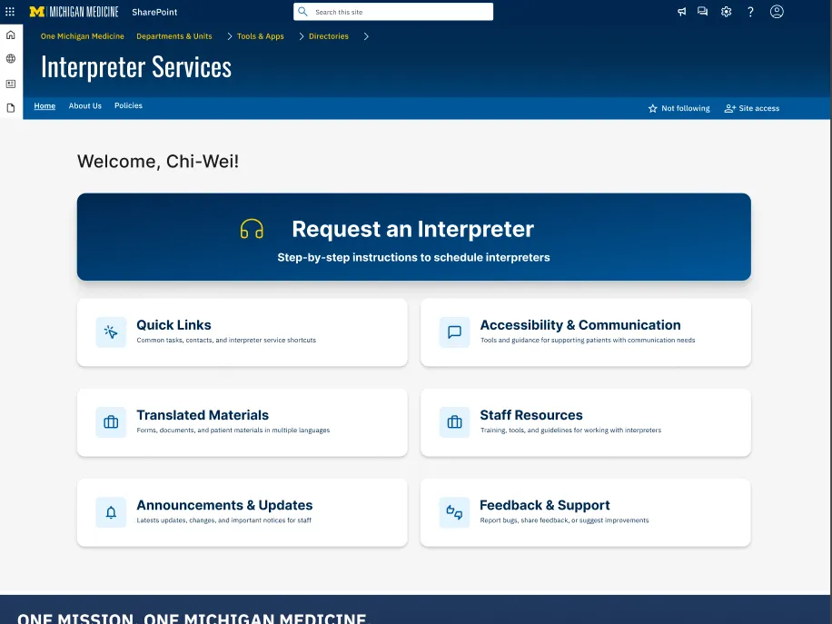
Two-theme automotive infotainment on one component system.
- Role
- Client
- Tools
The problem
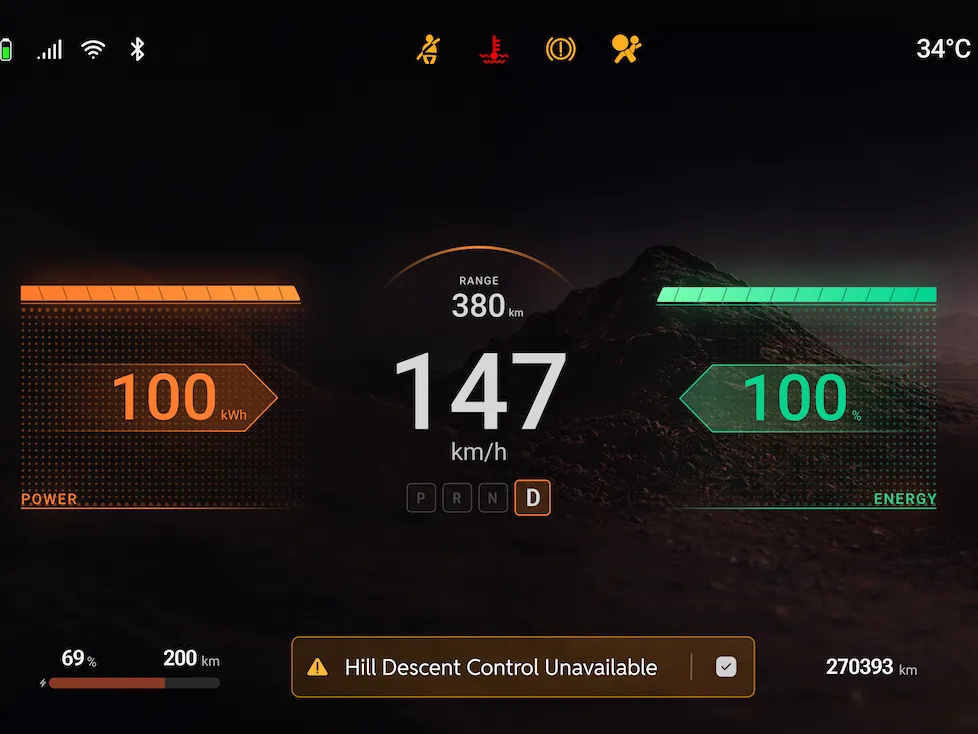
Our team was given a single reference screenshot as a starting point, with each designer building their own interpretation. The challenge was moving from a flat visual reference to a working automotive interface with real components — and finding a point of view rather than copying the source.
What I did
I broke down the existing wireframes, audited the components, and built my own design direction from there. The interface runs two themes on one component system: a standard version that stays close to the original, and a sport version that's mine. I kept the typography and completely changed the color palette, aiming at a gap I saw in what's currently on the market.
The outcome
A dual-theme interface plus a side-by-side view of how the whole team interpreted the same starting point differently.
My design — dual theme interface
Figma · click and drag to explore
Team process view — collective interpretation
Figma · click and drag to explore